Objects of Desire: Fernando Jorge
Luxury jewellery doesn’t behave like normal retail.
You don’t impulse-buy a £40,000 ring on your lunch break. You don’t scroll past it like trainers. Pieces like that demand attention. Time. A certain atmosphere.
And that’s exactly what the Fernando Jorgewebsite needed. Because while the jewellery had already reached that level, the digital experience hadn’t.
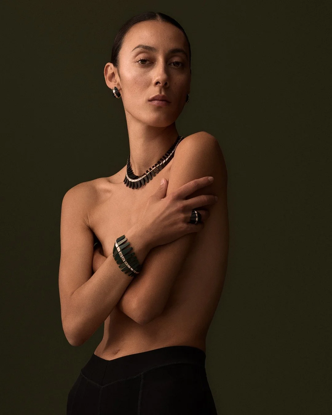
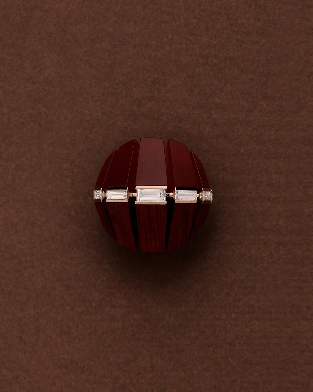
The brand had built an international reputation. Private clients across London, New York, Los Angeles, and São Paulo. Sculptural gold forms. Stones that seem to float rather than sit. Jewellery that feels sensual and architectural at the same time.
The problem was simple. The website wasn’t living in that world yet.
When the Brand Outgrows the Website
The project began in the way many good ones do. A quiet email from a new Head of Brand.
She had just joined Fernando Jorge and was already thinking about how the brand should evolve digitally. The first observation was obvious. The website needed a new lease of life.
At the time it lived on WordPress and carried the usual symptoms of an ageing build. Updating content was awkward. The structure didn’t encourage storytelling. Visually it felt a little safe, a little flat. Meanwhile the brand itself had moved on.
Fernando Jorge jewellery was being worn by collectors and clients around the world. The audience was international, sophisticated, and used to a certain level of luxury presentation.
The website design didn’t quite reflect that. So the brief was less about redesign and more about alignment. Bring the digital experience up to the level the brand was already operating at.
At the same time the company was preparing to expand globally. A much broader ambition, particularly in the US and Brazil. The platform would also shift from WordPress to Shopify, giving the team the flexibility and infrastructure needed to support a truly international jewellery brand digital experience.
But we weren’t interested in building a typical e-commerce store.
Luxury jewellery doesn’t work like that.
Luxury Jewellery Doesn’t Do “Add to Cart”
Most e-commerce websites follow the same formula. Endless grids. Filters. Buttons shouting “add to cart”. That approach makes perfect sense if you’re selling trainers or T-shirts. It makes far less sense when you’re selling jewellery that can cost more than a car. Fernando Jorge pieces range from around £1,000 to well over £100,000. They aren’t impulse purchases. They’re objects clients want to see, try on, discuss. The real sale often happens in a showroom. Which meant the website needed to do something different.
Instead of acting like a checkout machine, it needed to create desire and then guide clients towards a conversation. That shift in thinking shaped everything that followed.
Treating Jewellery Like Sculpture
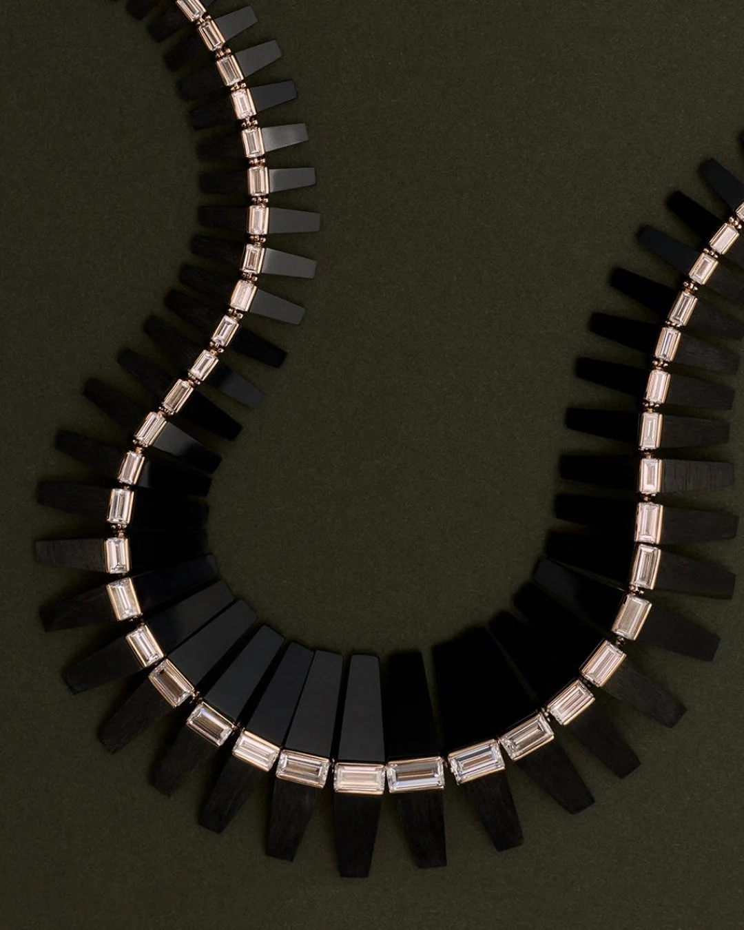
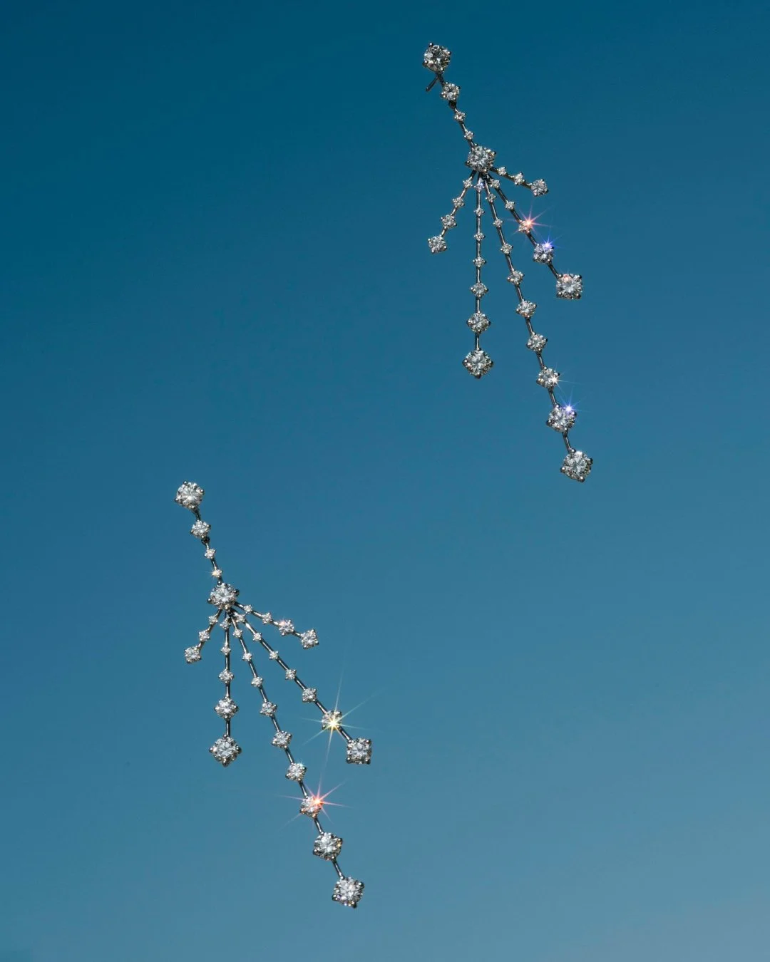
Fernando Jorge’s work sits somewhere between jewellery and sculpture. Fluid forms. Curved geometry. Diamonds and gemstones that seem suspended inside gold structures. The pieces feel almost architectural. So we approached the luxury jewellery website design with a very simple principle.
Treat the jewellery like sculpture.
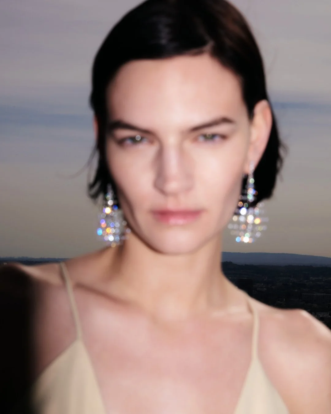
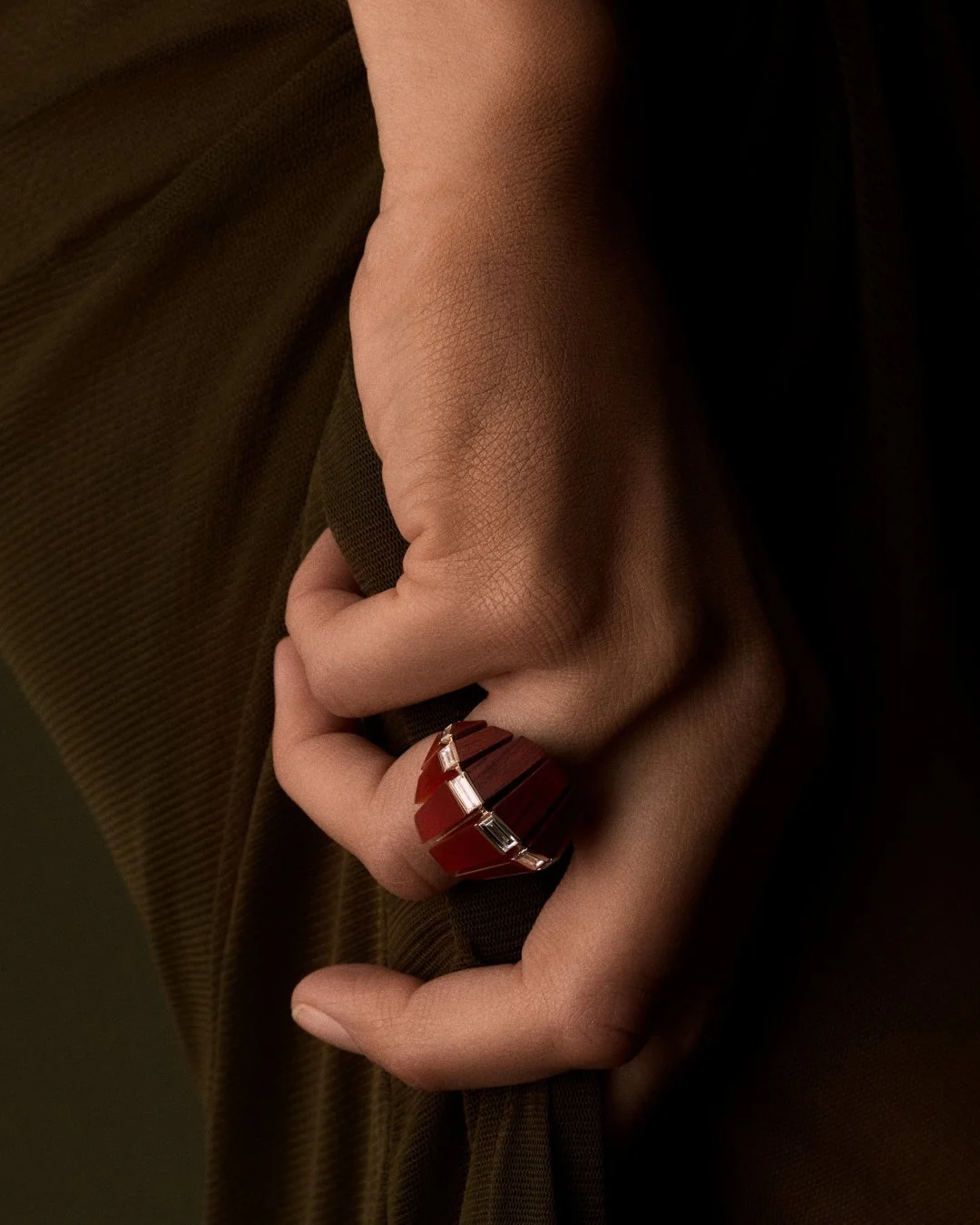
The interface stays quiet. Layouts breathe. Large imagery sits inside generous negative space. Nothing competes with the objects themselves. The brand’s internal team introduced a refreshed art direction and new campaign photography that pushed the editorial quality further. Our job was to create a digital stage that gave those assets space and theatre. And interestingly, that stage began influencing the content itself. When you give imagery room to breathe, people start producing better imagery.
Campaign shoots, editorial stills and product photography began rising to meet the environment we’d built. The site encouraged the brand to push its visual language further. That kind of creative loop is where the best projects live.
Blurring Editorial and Product
One of the things we wanted to avoid was the traditional divide between storytelling and commerce. Too many websites separate the two. Editorial content sits in one corner. Product listings sit somewhere else. The user jumps awkwardly between the two worlds. We wanted something more fluid.
Collections, stories and product pages share the same visual language. A visitor can move from campaign imagery into a collection grid and then into a specific ring or necklace without feeling like they’ve changed environments. It creates a more immersive jewellery e-commerce design, where each collection feels like a narrative rather than a catalogue. Every piece becomes a hero object. And the pacing of the site slows the experience down just enough to make you look properly.
Desire First, Checkout Later
The purchase journey is where the strategy becomes most obvious. Rather than forcing a traditional checkout flow, the site guides visitors towards enquiry. A client might start by exploring a collection like High Vertex. Editorial imagery establishes the mood. Sculptural product shots present each piece almost like an exhibit. Then they land on a specific ring or necklace. The object fills the screen. Details are explained with restraint. The interface stays calm. At that point a single action appears. Enquire.
Click it and the experience shifts from browsing to conversation. The enquiry references the exact piece the client is looking at, and connects them with the relevant showroom team in London, New York or São Paulo. The journey becomes beautifully simple.
Admire the piece.
Imagine wearing it.
Book the conversation.
That’s how luxury jewellery actually sells.
Space Is a Luxury
One of the most important design decisions on the site is also the least obvious.
Space.
Negative space around the jewellery. Space in the layouts. Space between sections as you scroll. That breathing room creates a sense of quiet confidence. The site never feels crowded or anxious to convert you. It simply presents the objects and lets them do the work.
Subtle animation reinforces that feeling. Images glide into view. Panels open softly. Nothing interrupts the rhythm. The result is a Shopify luxury brand website that feels calm, considered and slightly cinematic.
More gallery than online shop.
The Best Kind of Launch
When the new site went live, the reaction was… quiet. No dramatic reveal. No wave of surprise. Clients simply used it. In fact many behaved as if the website had always looked this way.
And in the luxury world, that’s probably the best result you can hope for.
The digital experience now sits comfortably alongside some of the most refined jewellery houses in the world. It reflects the confidence the brand already had. The craftsmanship was always there. The website simply caught up.
Sometimes the job isn’t to reinvent a brand. Sometimes it’s just to reveal it properly.